User Overlap
- Former user (Deleted)
- Florian Wilhelm
User Overlap allows you to easily run an analysis to get valuable and strategic insights on the user overlap between two items. It calculates the percentage of overlapping (unique) users that are included in both the input item as well as the comparative item. You will have all flexibility in terms of configuration and results will be processed very fast by the Mapp engine that uses a high-end technology to overlay the unique users IDs from the input item with all users in the other item, even cross-dimensional. The analysis takes into account one single day of data and the percentages are estimates with a sophisticated accuracy.
| Contents On This Page |
|---|
User Overlap Input
The below screenshot and list will give you a clear view of how the input variables to run the User Overlap analysis can be configured. It also contains additional information about the available dimensions that can be selected as Overlap input and output. Please note that selecting an input item is required to run the analysis.
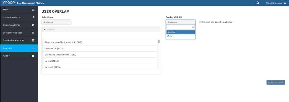
Select Input: Choose the relevant input item based on Mapp Audience or Mapp Pixel. The input item should have had activity over the past 24 hours, otherwise it will be labeled as 'invalid input'.
Input
The Input item can be described as a pool of users isolated in one of the following dimensions:
- Mapp Audience: a Custom or Lookalike Audience generated within the Mapp DMP.
- Mapp Pixel: a pixel created in the Mapp DMP that is being used to collect data.
Overlap With: Mapp User Overlap supports a cross-dimensional analysis between two different dimensions. This means that you are able to select a relevant Overlap dimension based on Mapp Audience or Mapp Pixel. By default this dimension will be the same as the input item.
Overlap with a specific item
It is possible to specify the overlapping items you would like to see instead of seeing all overlapping items. This way you’re able to focus on the items you’re really interested in.
User Overlap Output
Once you’ve configured the outlines of your analysis, hit ‘Run Analysis’. The report will now show you the output of the analysis in a visualized graph (1) and a table (2).
- Visual: Three types of visualization can be displayed on the output screen. You can choose the description buttons to change between the following charts: bubble chart, scatter chart, and bar chart. The scatter chart is set as default as it shows the output on a two-dimensional scale based on reach (size) and the percentage overlap.
Table: The table shows both information about the input item as well as a list of the top 25 most overlapping items based on the selected dimension. In case you would like to see all overlapping items, you can export the report by clicking on ‘Export’. This generates a .csv file. The table shows you the amount of overlapping users and the percentage of overlap.